Posts

the portfolio

Image
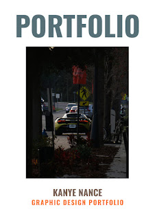
     After the last few months of uploading to this blog, I finally present to everyone, the portfolio. I made this portfolio using all of the work I have done in my FMX 210-1 Digital Media class, and turned it into a short and simple book that can be sent to employers and clients. Creating this portfolio was really fun, as I have never done anything like it before and I love trying new things. I love creating things with software, and this project was no exception. While in the process of creating this project, I used around 4 different Adobe software to pull this project together, and I had a blast doing it. I really think that a lot of people could benefit from creating a portfolio, as it is really fun and you learn a ton of useful digital skills while doing it. And without further ado, here is the portfolio.

somewhere cool (like next to Bob Odenkirk)

Image
So for this photo, I edited myself into a scene from the movie Nobody (2021) starring Bob Odenkirk. I chose this still because I thought that a shot like this really plays towards my skills in photoshop and I wanted to make the process anchored down in something that I know. I really enjoyed making this image, because I have never done something like this before and have always wanted to, even if it is just for an assignment. I haven't seen this film yet, but I intend on watching it soon, it'll go down on the list with the other 100+ movies on my "To Watch" list. But I do know this is a shot right before Bob Odenkirk's character starts to fight everyone inside of the train car. 

cool postcard i made

Image
  So for this assignment, I was told to create a postcard for a city that would be witnessing a total solar eclipse. I chose Columbus, Ohio, because I have always wanted to go to Ohio. Ohio is also where a very prominent figure on YouTube lives, Roman Atwood. He constantly conveys a positive message in his videos and is overall a good person. I consider him someone that I aspire everyday to be, by being kind and helpful to those around me.

3 important tools for indesign beginners

Image
      Today I'll be going over the 3 most important tools for InDesign beginners. All tools are extremely beginner friendly and should be really easy to learn. Without further ado, lets get into it!   1. Fill            I almost always use the fill tool when working in InDesign, it's really helpful when you need to color a bunch of shapes in really quickly. I think that beginners would really benefit from this tool because they may be filling their shapes by using the properties panel on the left of the workspace. This video is perfect for beginners, as they explain it really well and take it nice and slow. 2. Image Trace       The image trace tool is a simple but amazing effect, and I think that everyone who is new to InDesign should learn this technique. This video clearly and concisely explains how to use how to use the Image Trace tool, and two other extremely useful tools. The Image Trace tool is fairly self explanatory, however it is used to select the outline of somethin

cool photoshopped images i found

Image
      I think that this photo would be extremely hard to photoshop myself into because of the amount of grain and loss of detail in the photo would make it difficult to effectively use the Stamp tool. Also the angle of the image is very specific and I think that would also play a major factor in deciding to edit yourself into it or not.          This photo gave me inspiration for the "Somewhere" project because I think it would be cool to photoshop myself into a bus or a subway car. I have always enjoyed the film aesthetic that is produced from filming in small spaces like these, so that is another contributing factor for me choosing this image as inspiration. I already have an idea, a scene from Nobody (2021) right before Bob Odenkirk's character gets into a huge brawl while on the subway.              This is a photoshop fail photo that I think is really funny, because my aunt is an avid Micheal Jackson fan and I remember always listening to him while at her house when

black and white to color (kinda)

Image
      So for this project, I chose to use a photo from Gasparilla because I thought there was a lot of color that I could fill back in and make it look really good. I chose Complementary colors because I personally prefer the way that they look together, it is very easy on the eyes and gives a colorful and lively vibe to the image. I chose Spit Complementary colors because they are a little more harsh than normal complementary colors, and it brings out more of a pop culture art style to the image. Finally, I chose Triad colors because I thought I needed to spice it up a bit more, and I think that the colors that I chose for this really flips coloring norms on their head, as I used a darker color on an already dark fabric and it gives it more of a washed out feel.

the terror of the tag brush (i just needed a cool title)

Image
   So essentially this photo is made entirely out of a tag brush which I created during my Digital Media class. I enjoy the combination of different colors so I did a bit of a 3d effect with some of the tags, and my favorite color is purple, so the blue and red are there sort of as a statement that even though they are apart, they can still create something beautiful. The combined of the blues, purples, greens, and reds create a sense of childlike wonder, as all playgrounds and items that are consistently shoved in the faces of children are multicolor.